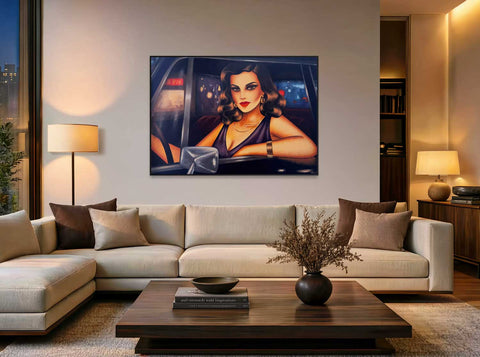
The wall above the sofa is one of the most prominent surfaces in a living room. Yet, it's surprisingly often underestimated.
In my consultations, I often encounter people initially choosing pictures that are too small. This is frequently due to being accustomed to certain formats from previous homes or not being able to imagine how naturally a larger original can appear in a room.
It's not about thinking as big as possible.
It's about the right proportion.
A picture above the sofa should form a convincing unit with the furniture, the wall, and the entire room. At the same time, art should retain its independence. It doesn't have to look like it was chosen to match the sofa, rug, and cushions.
I show in more detail how original art can work in other living areas in my article "Original Art for Living Spaces – How Art Gives a Home Personality."
This is precisely what I view critically in many perfectly styled interiors. The wall design seems harmonious, but often surprisingly interchangeable. A bit like a pre-assembled Pinterest image. The artwork becomes a pattern or a final decorative element – and thereby loses precisely what makes art interesting to me: its own language.
A good picture above the sofa should be able to do more than just fill an empty wall. It should be able to transform the entire living space.
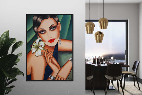
For example, a large-format female portrait can become a strong counterpart. A floral diptych can embrace the width of the sofa and simultaneously bring movement into the room. A single floral original, on the other hand, can create a completely different atmosphere with color, texture, and light.
Therefore, my selection doesn't start solely with measurements.
Of course, size and spacing must be right. But equally important are sightlines, room height, viewing distance, and the impact of the motif.
In this article, I show what I pay attention to – and how to find a picture above the sofa that not only hangs correctly but also gives the living room something of its own.

1. How large should a picture above the sofa be?
For pictures above the sofa, there's a simple guideline that can indeed be helpful:
A single picture or a cohesive picture composition can occupy approximately 60 to 75 percent of the sofa's width.
The two-thirds rule is often cited for this.
For a sofa with a width of 240 centimeters, a picture with a total width of about 150 to 180 centimeters can therefore look very balanced.
But I would never consider this rule a rigid guideline.
Because the same picture size can have a completely different effect in two living rooms.
A wall with a room height of 2.50 meters requires a different solution than a spacious living room with high ceilings. The viewing distance also plays a role. The further one sits from a work or looks across the room at the wall, the more generous the format can often be.
Concrete sizes as orientation
For a sofa of about 200 cm width, a picture width of approximately 120 to 150 cm can work well.
For a sofa of about 240 cm width, an interesting range is often around 145 to 180 cm.
For a sofa of about 280 cm width, a total width of approximately 170 to 210 cm can be very convincing.
For a diptych, the entire composition, including the small gap between the two pictures, is naturally counted.
Why many pictures above the sofa seem too small
In my experience, people tend to choose too small rather than too large.
This often has nothing to do with bad taste. People are accustomed to certain picture sizes and initially try to transfer them to a larger wall. Or a large-format original appears much more dominant on a screen than it actually looks in the room later.
This is precisely where digital room visualizations help enormously.
If I visualize the same living room once with a smaller and once with a more generous work, the difference is often immediately visible. The larger picture doesn't necessarily look bulkier. Often, the opposite happens:
The room appears calmer and clearer because the sofa, wall, and art suddenly form a coherent composition.
A large sofa therefore does not automatically demand a gigantic painting.
But a work that looks lost above the sofa hardly gets the chance to truly unfold its presence.

2. What I check first as an artist
When I select a picture for a client for above their sofa, I don't start with a chart.
I want to see the room first.
A photo is often enough to recognize many things: How wide is the wall? How high is the room? Where are other pieces of furniture? Are there windows, doors, or strong architectural lines? And from what distance will the picture primarily be viewed later?
Only then does a concrete size recommendation truly make sense.
The width of the sofa
The sofa is, of course, an important point of reference.
But I don't just look at the piece of furniture itself, but also the empty wall around it.
If a 240-centimeter-wide sofa stands against a wall only three meters wide, a different picture size will work than for the same sofa in front of a six-meter-long wall.
The room height
High rooms often tolerate more generous formats.
Here, a taller picture format can also be very interesting because it takes up the vertical architecture.
In lower rooms, on the other hand, a very tall work can quickly make the wall appear cramped. A generous landscape format often creates more tranquility there.
The line of sight
For me, it's particularly important from where a picture is perceived.
Is it visible upon entering the living room?
Do you look directly at it from the dining area?
Or do you mainly sit very close to it?
A work that is meant to be visible from eight meters away needs a different presence than a picture in a smaller, sheltered living area.
The motif itself
This point is often forgotten in size rules.
150 centimeters of picture width are not automatically 150 centimeters of picture impact.
A large-format female portrait has a very strong presence due to the face, gaze, and figure. A floral work of the same size can act more freely and strongly through color, form, and surface.
Therefore, I never decide solely based on centimeters.
I also look at how much visual weight the motif itself carries.
What is already present in the room
A living room with a striking rug, many colors, bookshelves, and special pieces of furniture may require a different art solution than a very minimalist room.
Sometimes a picture is deliberately meant to bring tranquility.
Sometimes a strong focal point is simply missing.
The real art of consultation for me is not just finding a "suitable picture," but finding out which work truly benefits the room and the people living in it.
This is particularly interesting for couples.
People often come to me because they are intuitively drawn to my imagery. However, both don't necessarily have to prefer the same work immediately. In conversation, I try to find out which colors, motifs, and moods appeal to both – and with which picture they could feel comfortable together in the long term.
Some clients have very precise ideas. Others can initially barely articulate what they are looking for.
Both are perfectly fine.
Today, such a consultation can also be conducted very well via video call. Together with room photos and digital visualizations, a fairly concrete idea of which solution works quickly emerges.
3. How high should a picture hang above the sofa?
A beautiful picture can lose a surprising amount of impact due to incorrect hanging.
I most frequently see paintings hung significantly too high above the sofa. A large empty space then arises between the furniture and the art – and both appear to have nothing to do with each other.
As a guide, a distance of approximately 15 to 30 centimeters between the top edge of the sofa and the bottom edge of the picture can work.
But here, too, the rule is:
The number is a guideline, not a law.
For a low sofa, a very high room, or an unusual picture format, a different distance might look better.
For me, it is crucial that the sofa and art are perceived as a single visual unit.
Don't just hang at eye level
For freestanding art, it is often recommended to position the center of the picture approximately at eye level.
Above a sofa, this rule only applies to a limited extent.
Because here there is already a strong point of reference directly below the picture.
If one were to work exclusively according to a general eye level, the painting could quickly drift too far upwards.
Therefore, I always consider both together:
Sofa + picture + wall space.
For female portraits, I also pay attention to the gaze
For a female portrait, something else comes into play for me.
Where is the face located within the painting?
A female portrait should not hang so high that the figure suddenly seems to float far above the people in the room. Especially with large-format portraits, the position of the gaze can be decisive for whether the work appears close and present or distant.
This can hardly be captured with a general hanging rule.
Here again, it shows why the effect of a specific artwork is more important than a rigid number.

4. Landscape, portrait, or square above the sofa?
Since a sofa is horizontally constructed, a landscape format initially seems to be the most obvious solution.
And indeed, it very often works excellently.
But it's not the only option.
Landscape format – the sofa's natural partner
Large-format landscape orientations pick up the horizontal line of the sofa, thereby quickly creating a calm, balanced composition.
For my female portraits, for example, a format of 140 × 100 cm works very well above a sofa. The work has enough presence without completely dominating the wall.
Especially an expressive female portrait in such a format can become the clear focal point of the living room.
I also love generous landscape formats for floral works. The blossoms and abstract forms can develop across the surface and achieve an almost landscape-like effect.
A diptych can act like a large landscape format
Many of my floral works are created as diptychs.
Two elongated canvases together form an overall composition.
Above a sofa, this can be particularly beautiful, as the two individual formats together again pick up the horizontal movement of the furniture.
At the same time, the narrow gap between them creates an additional tension.
For larger sofas or wide walls, this is often a very elegant alternative to a single large painting.
Square pictures – calm and focused
A large square appears more compact.
It can work particularly well if the wall is not extremely wide or if the motif itself is very concentrated.
A format of, for example, 120 × 120 or 140 × 140 centimeters can certainly have a strong impact above a wide sofa – provided the proportion to the entire wall is right.
Portrait format – by no means fundamentally wrong
I would never generally rule out portrait formats above a sofa.
A single small, narrow portrait format can indeed look lost.
But a generous portrait format can be very elegant in a room with high ceilings.
Even two vertical works side by side can create a strong overall composition. Together, they again achieve sufficient width, while the vertical lines simultaneously emphasize the room height.
So, the decisive factor is not:
Landscape format good, portrait format bad.
But:
What overall shape emerges from the sofa, wall, and art?
That's precisely why I don't view formats in isolation.
A picture doesn't just have to fit a wall in centimeters. It should take up the architecture of the room – or deliberately contrast with it.

5. One large original or several pictures?
Above a sofa, both work: a single large piece or a deliberately curated group.
Personally, I often prefer the tranquility of a strong original.
A large painting can anchor a wall. The eye doesn't constantly wander but stays with one piece. Especially in a living room that already contains many impressions from furniture, textiles, books, or lamps, this clarity can be very soothing.
For my female portraits, a large-format single work is often the strongest solution. A face, a posture, a gaze – all of that needs space. If too many smaller pictures hang next to it, the portrait quickly loses some of its presence.
When a diptych works particularly well
For my floral works, a diptych is often a very beautiful alternative.
Two elongated formats can form a broad composition together, thus taking up the horizontal line of the sofa. At the same time, some space remains between the canvases.
Precisely this small interruption can be exciting.
The two pictures belong together but do not look like a single closed surface. This creates more movement.
The important thing is that the diptych truly functions as a complete composition—and not like two pictures randomly hung next to each other.
What about several small pictures?
That can also be very beautiful.
Especially if a personal collection already exists or if different works are intentionally to be combined.
However, I would make sure that the wall does not become a collection of small decorations.
For me, the crucial question is always:
Should the art create a calm focal point—or should the wall itself become a diverse collection?
Which solution has a stronger effect depends on whether the wall should receive more focus or intentionally more variety.
But with a strong original painting, I would almost always give it enough space so that it can truly have an impact.
6. Female portrait or floral original above the sofa?
Above a sofa, both female portraits and floral original paintings can have a very strong effect.
However, they create completely different atmospheres.
Female Portraits – Strong Presence and a True Counterpart
A female portrait immediately draws the eye.
Faces possess a special presence. One perceives expression, posture, and gaze—and this quickly creates the feeling of a counterpart.
Especially in a rather minimalist living room, a large-format female portrait can therefore be very impactful.
It gives the room personality.
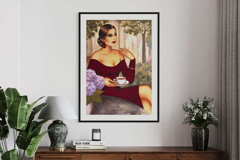
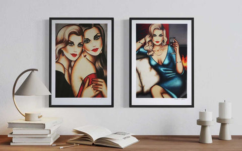
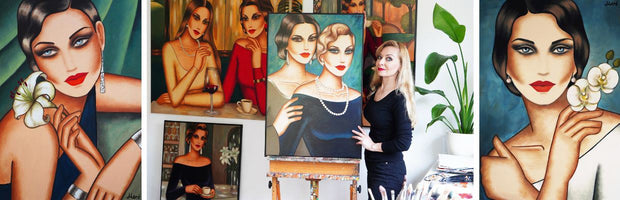
In my visual language of Feminine Glamourism, I combine female figures with clear forms, intense colors, and timeless elegance, reminiscent in part of Art Deco, fashion illustration, or classical poster art.
Above a sofa, such a work can become a visual focal point without the need for much additional decoration around it.
➤ More on this: "Female Portraits for the Living Room – Emotional Art on Canvas"
Floral Original Art – Color, Structure, and Movement
Floral works have a different effect.
My flower paintings originate from natural forms, but during the painting process, they sometimes depart from a botanically precise representation. Blossoms become larger, forms flow into one another, structures and metallic surfaces are added.
Especially above a sofa, this expansive formal language can work very beautifully.
A single horizontal floral piece can calmly connect the space. A diptych can bring more movement. And with works featuring gold or textured surfaces, the effect changes additionally with the light.
For me, floral original art is therefore particularly well-suited if a room is to have a strong eye-catcher, but this eye-catcher should be less figurative.
➤ More on this: "Modern Flower Paintings for the Living Room"
Which visual world is the right one?
This cannot be derived solely from the living style.
A minimalist room can benefit from both an expressive female portrait and a color-intensive floral work.
The decisive question is:
What presence do you want to experience in the room every day?
Should the picture act like a counterpart?
Or should it communicate more strongly with the interior through color, form, surface, and light?
Both can completely transform a living room—just in different ways.

7. Does a picture have to match the sofa in color?
No.
This is probably one of the questions where I would most emphatically disagree.
Of course, it can look beautiful if a color from the artwork reappears in the sofa, carpet, or individual textiles.
But a picture does not have to copy the existing color palette.
Especially then, a wall design quickly emerges that, although harmonious, lacks distinctiveness.
I often see interiors where the picture, cushions, carpet, and accessories perfectly repeat the same tones. Everything matches.
And yet the impression remains surprisingly arbitrary.
For me, art can have a different purpose.
A single color tone can be enough
Often, a complete color match is not even necessary.
Perhaps a Bordeaux from the painting is only found in a small detail of the room. Or a gold tone picks up the surface of a lamp.
Even such small relationships can ensure that art and interior appear connected.
Contrast can even be stronger
A beige or greige sofa does not automatically need a picture in beige, cream, and brown.
Especially an intense color can give character to a very neutral room.
A deep red, turquoise, royal blue, or a strong floral color scheme can set a completely new focus.
A female portrait with strong coloration can also work precisely because it does not completely adapt to the interior.
Consider wall color and materials
In addition to the sofa color, I therefore always look at:
-
wall color
-
wood tone
-
carpet
-
metal surfaces
-
curtains
-
existing art
-
light
A painting never only dialogues with the sofa.
It relates to the entire room.
So, art doesn't have to match the sofa in color. It should establish a compelling relationship within the room.
That's a big difference for me.
8. What makes an original over the sofa different
Especially over a sofa, a picture is often viewed from different distances.
One sees it upon entering the room, from the dining table, or up close when sitting.
With an original painting, the perception changes.
From a distance, the composition primarily works: color, motif, and overall form.
Up close, layers of color, brushstrokes, and small differences in the surface become visible.
In my female portraits, the surface is usually finer and smoother. Many layers of color are applied one over another until skin tones, contours, and surfaces develop the desired depth.
In my floral works, materiality often plays an even stronger role.
Textures, relief-like areas, and metallic accents react to daylight and viewing angle. A gold tone can appear almost subdued from one direction and shine much brighter from another.
It is precisely this changeability that I find particularly exciting.
An original above the sofa is therefore not just a motif on a wall surface.
It possesses a real surface and a physical presence in the room.
And precisely this work exists only once.
That is the essential difference for me: one chooses not just a picture motif, but a handmade original with its own history of creation and its own materiality.
➤ More on this: "Buying Original Paintings – A Guide for Beginners and Art Lovers".
9. The most common mistakes with pictures above the sofa
Most mistakes are not due to "wrong taste," but to an unclear overall effect.
The picture is too small
I see this particularly often.
A small picture can be very beautiful on its own. Above a large sofa, however, it quickly looks lost. Then no connection is created between the furniture, wall, and art.
Especially in spacious living rooms, one can often dare to use a larger format than one initially thinks.
The picture is hung too high
If there is too much space between the sofa and the picture, both elements appear separated.
For me, the art should visually belong to the sofa without "sticking" to it.
Therefore, I always consider the entire wall and not just a general eye level.
Too much decoration around it
A strong original needs space.
If small pictures, shelves, plants, wall objects, and many accessories compete directly next to it, the artwork quickly loses some of its impact.
Especially with a large-format female portrait or an expressive floral original, I would rather reduce.
Sometimes less is indeed more.
The picture is chosen only by the sofa color
Of course, art can harmonize with an interior in terms of color.
But if the most important selection criterion is: "The beige matches the cushions perfectly," the artwork quickly becomes a decorative element.
I would always ask:
What does this picture additionally bring to the room?
More depth? More tension? Calm? Color? Presence?
An artwork can be connected to the interior without disappearing into it.
The impact of the motif is underestimated
Two paintings of the same size can have completely different effects in a room.
A female portrait 150 centimeters wide has a different presence due to the face, gaze, and figure than a floral work of the same format.
Color contrasts, brightness, and composition also change the visual weight of a picture.
Therefore, it is not enough to only compare size or color.
The correct picture size is always also a question of the motif.

10. How to see before buying if a picture really works
With a larger original painting, one wants to be as sure as possible that the format and effect suit one's wall.
There are two simple ways to do this.
The quick solution: mark the format on the wall
With painter's tape or paper, the planned picture size can be marked directly above the sofa.
This helps particularly to get a feel for the actual width and height.
Many people are surprised how much larger a format can appear on the wall than on a screen—or conversely, how naturally an initially "large" looking painting fits into a spacious room.
Even more helpful: a digital room visualization
In my consultations, I therefore like to work with digital room visualizations.
For this, I usually only need:
-
a photo of the sofa wall taken as frontally as possible
-
the width of the sofa
-
the approximate wall width
-
room height, if known
-
and the works that already seem interesting
Then I can visualize various originals and formats directly in the room.
This is often very helpful, especially for couples.
Instead of discussing abstractly whether 140 centimeters might be too large or if a certain female portrait could appear too dominant, one sees a concrete situation.
Often, it quickly becomes clear which work functions.
For me, consultation means much more than size calculation
Not everyone immediately knows which work is right. Some clients come with a specific idea, while others first want to see various options in their own space. In both cases, a room photo, conversation, and visualization help to narrow down the selection. Sometimes this leads to an existing original, sometimes to an individual commissioned work.
For me, the real task is to listen carefully and find out which works could truly suit the people and their space.
Sometimes that's an existing original.
Sometimes several works are suitable.
And sometimes this leads to the idea for an individual commissioned work.
Such a consultation can also be carried out very well via video call today.
Ultimately, a picture should not simply "fit."
It should be a work that one enjoys living with.
Personal consultation for the wall above the sofa
If an original from my current collection is of interest, you are welcome to send me a photo of your sofa wall and the approximate dimensions.
I can assess which formats are suitable and, if desired, create a digital room view with selected works.
Discover current original paintings in my online gallery
or
Request a personal consultation: info@ekaterina-more.com
FAQ – Pictures above the sofa
How big should a picture above the sofa be?
As a guide, a single picture or a coherent picture composition can occupy approximately 60 to 75 percent of the sofa's width.
For example, for a sofa 240 centimeters wide, a total width of about 145 to 180 centimeters can work well.
However, this rule is only a starting point. Wall width, room height, viewing distance, and subject also play an important role.
A large-format original can certainly be chosen more generously if the room offers enough space.
How high should a picture above the sofa hang?
Between the backrest of the sofa and the bottom edge of the picture, approximately 15 to 30 centimeters can be a good starting point.
More important than a rigid number, however, is that the sofa and art visually form a unit.
If the picture hangs too high, it quickly gives the impression that it floats on the wall independently of the furniture.
For large female portraits, I also pay attention to how high the face and gaze are within the artwork.
Which format is suitable above a sofa?
Landscape formats often work particularly well because they pick up the horizontal line of the sofa.
Large square pictures can also appear very balanced.
Portrait formats are by no means excluded. A generous portrait format or two vertical works can be very interesting, especially in high rooms.
Floral diptychs are also well suited if both canvases together form a wide overall composition.
Is one large picture or a group of pictures better?
Both can work. Above a sofa, I often prefer a single large-format original because it creates calm and gives the work enough presence.
However, a thoughtfully curated group of pictures or a diptych can also have a very strong effect.
The deciding factor is whether the wall should have a clear focal point or rather the character of a personal collection.
Does a picture have to match the sofa in color?
No. A work of art can pick up individual colors from the sofa, rug, or other materials, but does not have to copy the existing color palette.
Especially a deliberate contrast can give a neutral living room more personality.
For me, it is more important that the picture and the room enter into a convincing relationship than that all colors are precisely coordinated.
Can I see how an original painting looks above my sofa before buying?
Yes. With a photo of the sofa wall and some approximate measurements, I can digitally place selected original paintings into the room.
This makes it easier to assess before purchasing which size, format, and pictorial world will be most convincing.
Such a room visualization does not replace the materiality of the original, but it greatly helps to realistically estimate proportion and overall effect.